A guide by Blots Pen & Ink Supplies
Calligraphy means beautiful writing. In our modern world we are very familiar with clear, sharp and stylish lettering most of which is produced by computers. Handwriting with a pen is a different story. For many of us the only writing we do will be a scribbled shopping list; a note for the milkman (what’s a milkman?) or a quick message in a birthday or Christmas card! For many of us our writing is not in the wildest imagination beautiful.
However, Calligraphy is not restricted only to those who are artistic; have studied and practiced for years and have mountains of expensive equipment. Most people who spent a morning with simple pens and paper could, with a little guidance, start to write beautiful letters.
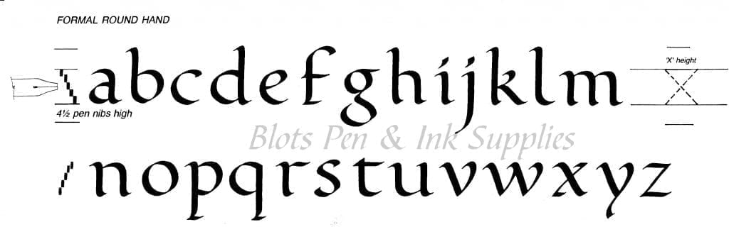
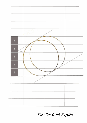
Calligraphy letters are drawn to set proportions, otherwise the letters appear tall and lanky, or short and dumpy. The proportions relate to the width of the nib. The height of the simple letters (a, e, o, x..) is four and a half or five nib widths. This is called the ‘x’ height. Other letters have a stick or ascender which goes up (b, d, h..) or down descender (g, p, q..). The Round or Foundational letters are based on a circle; Italic letters are based on an oval. A simple start can be made by putting two pencils together with a rubber band.
The pen is held at a set angle on the paper and it is this angle that gives the letter its varying width as it is drawn. Round or Foundational letters are written with the pen at 30° and Italic letters at 45°
All rules in calligraphy are there to be broken. However a good rule is to first learn how to do them consistently and correctly before breaking the rules.
There are many different forms of letters and you will find many variations. Round Hand or Foundation are the letters that most people try first. A square cut calligraphy nib is designed to be pulled or slid across the paper. If it is pushed it will probably dig in and splatter ink on your page. Each letter is formed with separate strokes. The graphic above will give some idea of how some calligraphic letters are formed.
Letters can be drawn using the two pencils, a broad square felt tip pen or a calligraphy pen. It is best to practice the simpler letters of the alphabet first. The emphasis is always on practice. Do not be discouraged if your initial attempts are very varied.

Draw lines on a sheet of paper (have plenty of paper available – photocopying paper is ideal). For Round Hand letters use an ‘x’ height of 4½ nib widths; and 4 nib widths each for the ascenders and descenders. Start by exploring the pen at different angles and see how the pen produces thick and thin lines. These variations are what characterises a calligraphic letter. Hold (and keep) the pen at 30° to the horizontal and draw a circle. Try copying the letters below.