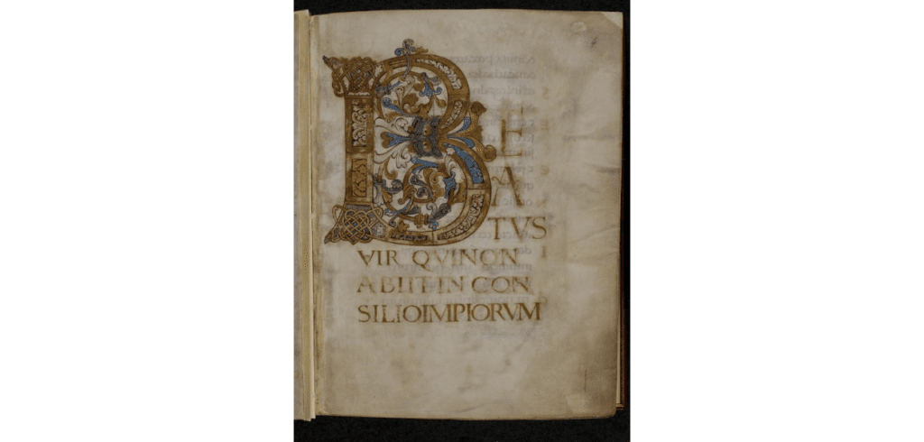
Edward Johnston (1872 – 1944 ) is largely credited with the revival of Calligraphy in Britain and Europe, with the Round Hand script being accredited to him. The Round Hand or Foundational script style traces its roots to the Carolingian minuscule style of writing and the Psalter of Oswald. The Psalter of Oswald being a medieval illuminated book of Psalms, believed to be created in the last quarter of the 10th century. And so with this inspiration the foundational hand or round hand script was born.
The Arts and Crafts revival movement during the Victorian period, was a reaction to the industrialisation of the Arts and Crafts sector; with the perceived belief at the time of diminishing standards in the quality of arts / craft goods being produced along with. Works were initially completed during this period by William Morris (1834 – 1896), an infamous designer of this period, with Johnston building upon this work.
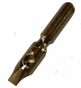
Both Johnston and Morris used a broad nib to achieve the rounded lettering, similar to the letter o; which can be seen in this type of script. Johnston coined the name ‘foundational’, as he believed that this type of script was a good place from which to start learning calligraphy. Those who wish to practise round hand should try with broad nibs, such as the William Mitchell Round Hand Nib Size 0.
Round Hand writing is achieved by taking your nib and at a 30 degree angle to the page, round hand letters are meant to be full bodied, round and broad. Unlike a pencil or marker, numerous strokes for certain letters are necessary, with the pen pulled downward or to the right. Lined calligraphy practice paper such as the Rhodia 5 x5 Pad or Bienfang 206 Paper, is a good place to start as both pads are marked out with lines for practice.

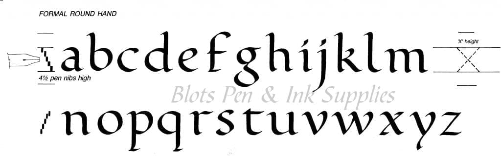
There are many different forms of letters and you will find many variations. Round Hand or Foundation are the letters that most people try first. A square cut calligraphy nib such as the William Mitchell Round Hand Nib is designed to be pulled or slid across the paper. If it is pushed it will probably dig in and splatter / spray ink on your page. Each letter is formed with separate strokes, down and too the right. The graphic below will give some idea of how some calligraphic letters are formed. Letters can be drawn using the two pencils, a broad square felt tip pen or a calligraphy pen. It is best to practice the simpler letters of the alphabet first. The emphasis is always on practice. Do not be discouraged if your initial attempts are very varied.
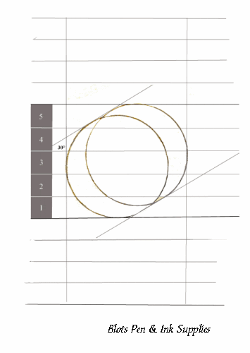
In the above animated graphic you will notice the grid layout of the page, the recommended ‘x’ height; being the height of the main body of the letter is 4½ nib widths, and then for the ascenders so for example the rising stroke of a letter ‘h’ is 4 nib widths and likewise the descenders the beneath the line part of a ‘p’ is 4 nib widths; ascenders and descenders. Below you can see an example of the round hand alphabet, if you wish to practice remember to hold the pen at a 30 degree angle to the horizontal, try write the letter ‘o’. Practice makes perfect.
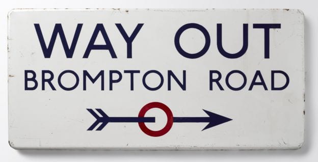
And a fun fact to leave on, Edward Johnston being largely credited with creating the round hand script, also created the typeface and roundel originally used on the London Tube. Below you can see an example of a Tube sign, from the Ditchling Museum of Art and Craft. There has been slight redesigns over the years, but the font remains largely similar to the original 1916 design of Johnston. To find out more about Edward Johnston, please click here, which will take you to the London Transport Museum.